Unhidden But Unnoticed Amazing Creativity In 5 Great Common Logos You Should Know
Unhidden But Unnoticed Amazing Creativity In 5 Great Common Logos You Should Know.
Checkout the 5 best, Unhidden But Unnoticed Amazing Creativity In 5 Great Logos You Should Know Below:-
1. The MGM Lion Logo
Metro-Goldwyn-Mayer Studios Inc. is an American media company, founded in 1924, that produces and distributes feature films and television programs. It is based in Beverly Hills, California. It was formed by Marcus Loew by combining Metro Pictures, Goldwyn Pictures, and Louis B. Mayer Pictures into one company.
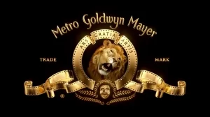
There’s been lots of speculation over how the lion roars in the MGM studios’ mascot since 1916, was filmed.
Dated back to a time long before CGI, there must have been real lions involved – how did the film crew get them to cooperate, and were there any casualties in the process? After all, lions aren’t notorious for their ability to roar on cue. Rather, they are known to be vicious, wild animals. So how did they do it?
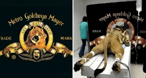
The above photo that’s been circulating the web in recent years seems to explain it – the lion was tied down by the film crew and manipulated until they got the roar on film. However, it turns out that this photo is nothing more than some creative photoshop work – in reality, the MGM lion on the left was filmed the old-fashioned way, and the photo on the right is an edited photo of a lion undergoing a CT scan.
Checkout the MGM AV LOGO Video Below:-
RELATED: Justin Bieber Displays Tattoo Removal Method In A Pair Of White Shorts
2. Gillette Logo
Gillette is an American brand of safety razors and other personal care products including shaving supplies, owned by the multi-national corporation Procter & Gamble (P&G).
Based in Boston, Massachusetts, United States, it was owned by The Gillette Company, a supplier of products under various brands until that company merged with P&G in 2005. The Gillette Company was founded by King C. Gillette in 1901 as a safety razor manufacturer.
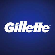
In a simple yet effective way, the logo subtly makes reference to the razor with the negative space in ‘G’ and the ‘I’ which resembles the shape of razors. Think of Gillette’s razor and its sharpness, the logo embodies this.
Checkout How To Shave – Shaving Tips For Men Gillet video below:-
READ ALSO: How to Easily Download YouTube Videos on Your Pc (Using VLC Media Player)
3. LG Logo
LG Electronics Inc. is a South Korean multinational electronics company headquartered in Yeouido-dong, Seoul, South Korea. LG Electronics is a part of LG Corporation, the fourth largest chaebol in South Korea, and is often considered the pinnacle of LG Corp with the group’s chemical and battery division LG Chem.
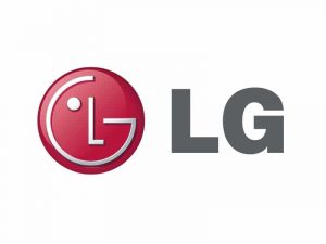
The logo of LG Electronics appears to be a winking emoji face at first glance. On a closer look, you will discover that G is the outline of the face while L represents the nose. According to some fans, LG’s logo resembles a modified Pacman.
Checkout LG Electronics at CES 2019
4. Amazon Logo
Amazon.com, Inc. is an American multinational technology company that focuses on e-commerce, cloud computing, online advertising, digital streaming, and artificial intelligence.

You can find anything on Amazon and this company wants you to know that once you look at the logo. A simple and effective logo with an arrow moving from A to Z is not a coincidence at all.
Amazon’s logo wasn’t always like this, the first logo that was used when Jeff Bezos started in 1994 was nothing compared to this in terms of creativity, as the company expanded its products and began offering other things apart from books, the logo was modified. It was not until the year 2000 that they started using this one.
Checkout Introducing amazon Go and the world’s most advanced shopping technology video below:-
RELATED: Who And How Many Times Kim Kardashian Married And Dated?
5. Toyota Logo
Toyota Motor Corporation is a Japanese multinational automotive manufacturer headquartered in Toyota City, Aichi, Japan. It was founded by Kiichiro Toyoda and incorporated on August 28, 1937.
Toyota is one of the largest automobile manufacturers in the world, producing about 10 million vehicles per year. Toyota Motor Corporation is a Japanese multinational automotive manufacturer headquartered in Toyota City, Aichi, Japan.
It was founded by Kiichiro Toyoda and incorporated on August 28, 1937. Toyota is one of the largest automobile manufacturers in the world, producing about 10 million vehicles per year.

Car logos are not without their own hidden meanings too, and the logo of Toyota will show you that. According to official sources, the three ellipses on the logo represent “the unification of the heart of our customers and the heart of Toyota products” while the white space in the background symbolizes “Toyota’s technological advancement and boundless opportunities ahead.”
However, this is not the only explanation for the logo. Some people believe the logo looks like a thread passing through the eye of a needle and this is to symbolize Toyota’s beginning in the textile industry. Find a more symbolic message in the next post.
Checkout the video of The hidden meaning of Toyota Revealing Lagos Below:-
MORE OPTION: 10 Websites To Find Remote Jobs No Experience With USD Salary


